UX/UI Case Study: Fixing usability for specialty coffee guides

Introduction
Overview | You save me from bad coffee, I save you from bad UX | Who needs a saviour? | Reality check | Role and process
Overview
I can’t stand bad coffee. Good coffee is so easy to make, yet 99% of all coffee places make a poor job of it. Bad coffee can ruin my day.
Because I had no guide for specialty cafés, I’ve slowly developed heuristics to help me decide if a place is worth even trying. Eventually, a North London barista told me about the Best Coffee Guide [abbr. BCG] and my coffee life changed ever since. BCG saved me from bad coffee.
Disclaimer: I’m in no way affiliated with BCG.
But the BCG app has some flaws:

Since they saved me from bad coffee, I wanted to save them from bad UX — this case study is about increasing the number of premium accounts with the least effort. A quick heuristic evaluation also shows a number of critical usability problems while using the app — and I’ve chosen to look deeper at the ones that can be solved with UX.
Challenge of a challenge
I thought doing a case study to improve a specialty coffee guide would be a win for everyone in the specialty niche. I wrote BCG to tell them about the case study I planned and waited several weeks for an answer. Getting no reply was a clue in itself — I’ve learned that creating a win-win for everyone was the first assumption I had to test. So I built a mindmap to find out where my intention was in the grand scheme of coffee things.

The mindmap bounced me back to a more skeptical approach where I would investigate:
- whether cafés are happy that such guides exist;
- if cafés don’t want to promote such guides, what are other credible touchpoints where a specialty guide can be promoted? Roasteries or other suppliers maybe?
- what types of people “deserve” to be accepted into the “High Society of Specialty Coffee”? Is specialty a closed niche or does it need a yearly flux of “ignorants” migrating to specialty? and what prevents “ignorants” to consume specialty?
Short answers [read “assumptions”]: every café is on its own, such guides don’t serve the interest of particular cafés; and cafés rely on connaisseurs, not on ignorants. Perhaps this is an oversimplified (and biased) answer, but nevertheless, it’s a more realistic assumption to start designing with.
Reality check
As I wanted to get real insights from people in the industry, I’ve written emails to Specialty Coffee Association, London Coffee Guide, European Coffee Trip, and to two cafés (my current coffee supplier and a specialty pioneer from Bucharest). I wanted to find out three things: 1) would cafes want to promote a coffee guide? 2) are cafes interested to attract ignorants as well, since ignorants make 99% of the whole coffee market? 3) what are other credible touchpoints, assuming cafes don’t want to promote such guides?

I didn’t get any reply, but I was lucky enough to have a friend who owns a specialty café and who provided me with priceless insights into all my questions, during an interview.
Role and Process
In my first UX project I’ve focused on solving GPS technology problems with user-centred design. But for this project I wanted to get a grip on the real context of where a product lives. The process I’ve followed is the same classical double diamond framework, but the work was significantly different.

As this was a Bootcamp UX project, I managed all roles, while getting punctual guidance from a designated UX tutor. As a business stakeholder, I wanted to have an edge over the competition on the key tasks, using only UX. As a student, I wanted to envision the maximum potential of a product and to develop the competence scale pictured below:

1. Discover
- Desk research. Statistics
- User interviews
- Product (app) reviews
- Competitive analysis. SWOT
- Key insights
1.1 Desk research. Statistics
I’ve learned to use quantitative measures only as part of a triangulation strategy. In this case, I wanted to find out how many specialty cafés are in the world compared to the total number of cafés. US statistics from SCA (Specialty Coffee Association) include chains like Costa and Starbucks in the specialty niche, so these sources are not reliable; but SCA (via Euromonitor) has reliable info about the total number of cafés in EU (around 344k in EU in 2018). European Coffee Trip (abbr. ECT), a true specialty guide, has so far put 2038 European cafés on the map. We can derive a simple heuristic by combining these two sources (SCA credible on a total number of cafes, ECT more credible on quality):

In EU, for each 100 cafés, less than one is true specialty.
This might not be reliable or very precise, but what really matters is the two orders of magnitude of a difference. The insight is more qualitative in nature: if you don’t use a specialty guide, the odds of randomly entering a specialty café as a tourist are almost none.
1.2 User interviews

In my mindmap exercise, in order to empathize with other points of view, I’ve drafted a whole range of assumption user groups along a timeline, starting with anti-users and then moving from ignorants to connaisseurs. Because I’m totally reliant on good coffee and therefore I’m isolated within a single user group, I wanted to find out:
- why people who’ve discovered specialty quality still drink bad coffee?
- going back in time, how did they find out about specialty coffee (and how they recognize it)?
- how do they solve the “good coffee” problem when they’re traveling?
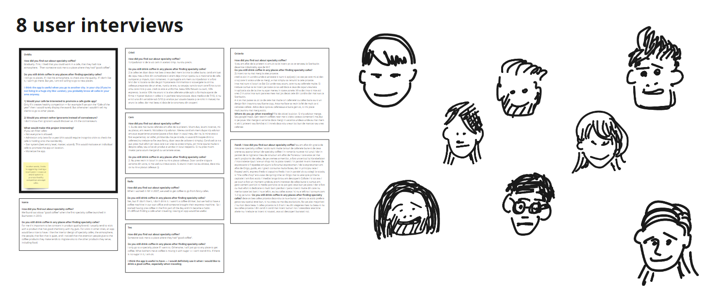

Main insights from interviews:
- When people travel, they acknowledge finding specialty cafes is a challenge. This required adjusting the user groups (I’ve added a new group — tourists).
- People like to experiment with new places having a nice atmosphere — more than they despise bad coffee, and even when their specialty knowledge is extensive.
- When looking for a specialty café, they scan for visual clues like design style, types of coffee drinks and food offerings, photos, and reviews.
1.3 Product (app) reviews
Most reviews of the BCG app are about frequent crashes, changing the pricing model without properly communicating it, lack of coverage outside London, and the impossibility to add cafés. In terms of socio-technical vision, most requests are on IT and on the community level.

The main insight: BCG fails on the software level, yet people still use the product because they trust the selection of cafés provided.
Since I have no insights from BCG, I will assume for our project that the software level will never be repaired, but that new cafés can be added by the developer (so I am assuming the community level will be more or less addressed).
This leaves the HCI (human-computer interaction) level of opportunity the highest level where we can save the product from failure. (And this is what my case study is about).
1.4 Competitive analysis. SWOT


I’ve compared five specialty guides, each having at least one strength over the others. The greatest UX opportunities for a specialty guide are:
- offering the tourist perspective (tell stories with images)
- performing a fast and usable search with filtering and directions options.
1.5 Key insights

2. Define
- Opportunity and product vision
- Key user groups
- Persona(s)
- Key tasks. Pain points
- Journey map
- User stories
- Wire flows
2.1 Opportunity and product vision
The competitive UX opportunity for a specialty coffee guide: built with tourists in mind, and performing a fast and usable search around a location, with filtering and directions options.

2.2 Key user groups

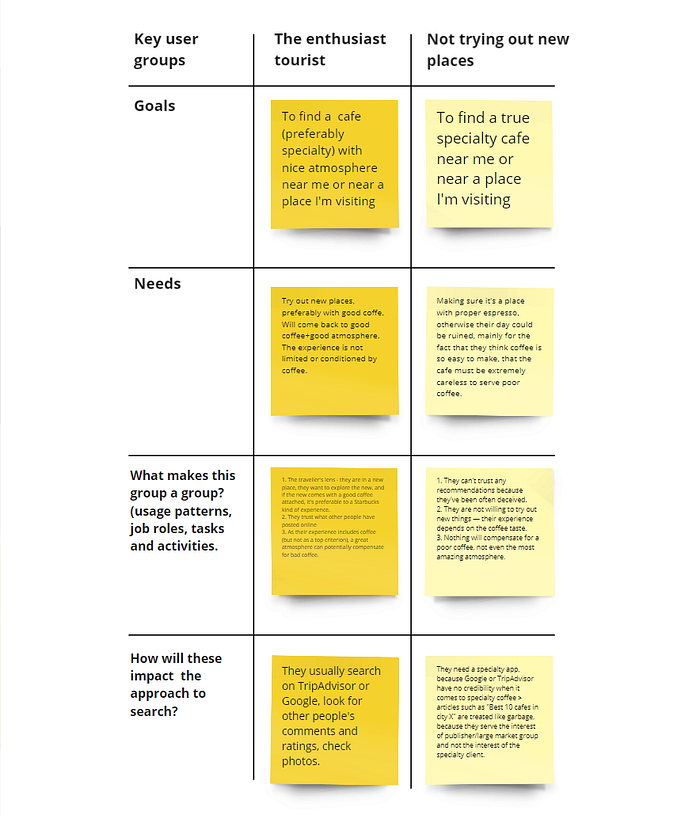
People want to experiment with new cafés — from newbies to connoisseurs. The Discoverers (newbies) and the Enthusiasts (connaisseurs) have similar mindsets as the Tourists, so I’ve combined them into one main user group: The Enthusiast Tourist.
The most different user group which is not an anti-user group is Not trying out new places. These people only go to a café if recommended by a credible source — and even then, they are skeptical until they have a proper experience.
2.3 Personas

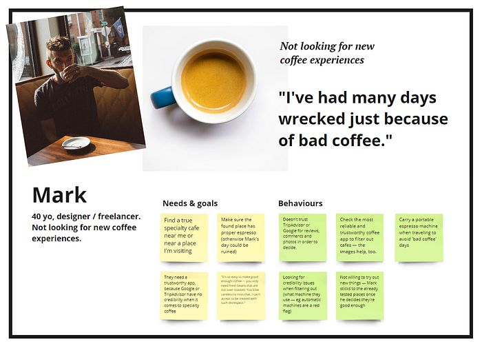
I decided to leave the main needs of our secondary persona (unbiased reviews) for the second phase of my project.
2.4 Key tasks. Pain points
Most often, our primary persona wants to find a specialty café around them, get directions for Google, “save” the café for later and maybe share it with friends. The more general case, which includes the tourist perspective (and which gives the competitive edge over all other specialty apps) is: find a specialty café around a specific location, get directions on Google, save café for later and maybe share it with friends.
Our secondary persona is pickier: they want granular control over the experience (they need filtering), they want to check other people’s experience, and — in our second project phase — they will need to see more detailed reviews (eg reviewing the espresso quality separately from the design or atmosphere or other visual criteria which might bias the “espresso score”).


- For BCG, the acute pain point is: you can only see cafés around you — and a third of users might never realize they can buy a subscription. And you can’t search around an area: it’s only around you or by city.
- The significant drawback of ECT: you can’t search based on where you are — it’s just a webpage showing cafés. Your search will be visual only.
- Yelp results for “specialty café” are not reliable, because Yelp is a business directory — they encourage people to post “cool” or “fancy” reviews. Yelp is fast, but this only helps you find the wrong places faster.
2.5 Journey map
The journey map begins when Jo, our primary persona, realizes she needs to find a specialty cafe near a park where she’s meeting with her friend tomorrow. And it ends when Jo has saved a few options and shared them with her friend.
Europe Coffee Trip journey map

With ECT, it’s a little tricky to get the map area view you want:
- city guides thumbnails have the same look as individual cafes thumbs;
- clicking on a country guide thumb with multiple cities sends you to the city you clicked on, thinking you clicked on the country;
- depending on the browser, you might get no cafes at all;
- you see clusters of cafes, and your search has to be visual, using a cumbersome tool for zooming in and out; if you scroll, the page scrolls down, moving the map off-screen; cafes clusters unpack into real cafes pins only at max zoom, which can move your reference area off-screen;
- jumping back from a dedicated cafe page to the map area containing the pin you clicked on takes you instead to the initial city map view, which means all your journey to zooming, panning, and getting to a particular area is lost;
- Since most cafes only have one photo (or none), you need to check other sources of photos for each place before having a first impression. If you’re not familiar with copying and pasting from one tab to another while browsing, the task might get stressful.
Best Coffee Guide journey map
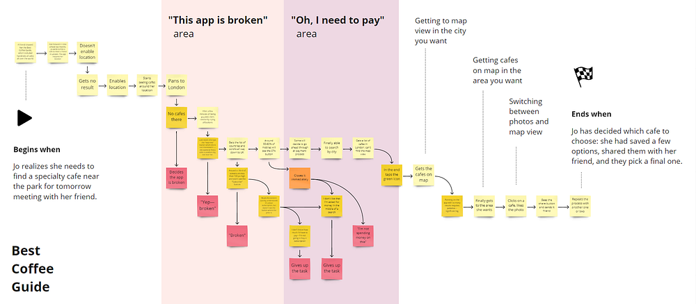
With BCG, before you get to view the map area you’re interested in, you might quit the task up to five times:
- If you’re not aware you’re on the free version, you’ll visually pan and zoom the map to the area you want, only to find no cafes;
- Anything you want to do under the “Near Me” button is actually a search in another city, which is confusing — and that’s when you’ll be shown the most important popup asking you to subscribe;
- If you’re amongst one-third of mobile users with screens less than 720 px height, you won’t see the call to action button to pay £3 for a subscription;
- you might have the patience to read lots of text, you might have the inspiration to scroll in order to reveal the CTA button, but you could end up being unclear why and what you pay for;
- even if you get the CTA button and even if you read the pop-up content (which is significant), you might decide you’re not going to spend money on this, just because you’re not clear from the long text what the benefits are.
Benchmark prototype journey map

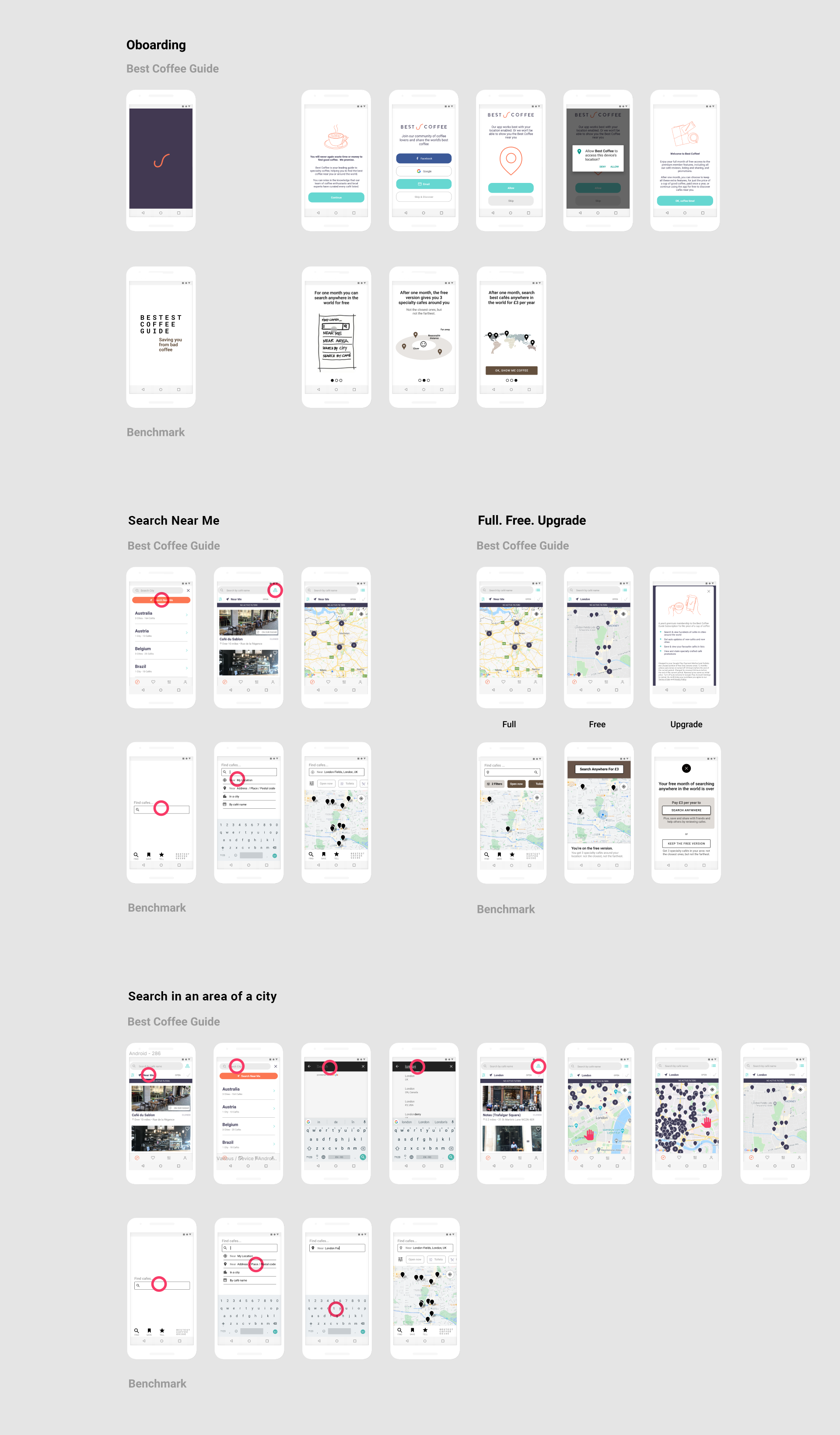
The prototype, created as a benchmark for improving BCG:
- It takes three clicks to find and share a specialty cafe near you or near a specific area;
- The onboarding explains in three cards 1) what full version is (search near you, near a location, search by city or cafe name); 2) what the free version is after one month; and 3) what the full version is after one month;
- Both onboarding and the message after a month will ask for input from you (for example):
Your trial ends tomorrow.
Pay £3 per year to search anywhere in the world, or continue using the free version which shows you 3 cafes around you — not the closest 3, but not the farthest 3 either”.
[Buttons: “Let me use the free version” and “Search anywhere in the world”] ;
- The free version will look different, to signal it’s not the full experience.
2.6 User Stories
The main user story includes all key tasks (and the other user stories):
As a couple traveling tonight to London and meeting two friends in London Fields park tomorrow, we want to find now a nice specialty cafe around the park, ideally with with a terrace, dairy-free drinks, tea and maybe a sandwich. Then we want to share them some links so we can pick our meeting point.

2.7 Wireflow

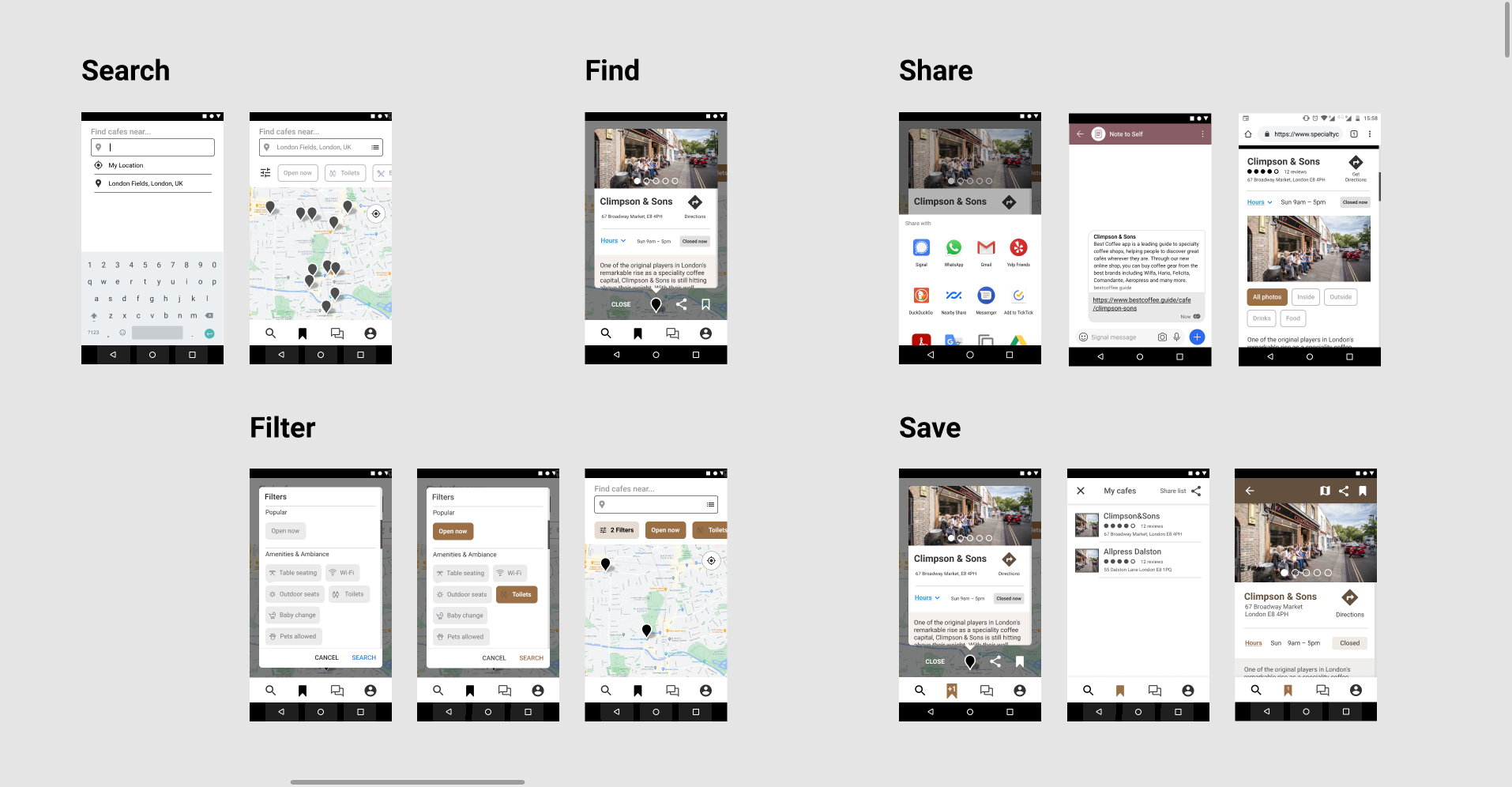
Wireflow based on the user story — illustrates the minimum number of steps necessary to find a specialty café near an area or a city.
None of the specialty guides has this functionality — they all require you to search visually on a map.
3. Develop
- User scenarios
- Mid-fidelity prototype
- Usability testing (1&2) and insights
3.1 User scenarios
I’ve built the user scenarios for usability testing around the two pain points:
- [Comparative usability testing 1] Make “Find, Share & Save” an “effective, efficient and pleasurable” task;
- [Comparative usability testing 2] Improve the BCG onboarding to increase the number of premium accounts.
3.2 Mid-fidelity prototype
I’ve built the first version of the prototype around the user story containing all key tasks (as a tourist, find a cafe near a park in London and share it with a friend).
3.3 Usability testing 1&2

I’ve done two comparative usability tests on three different systems: European Coffee Trip [ECT], Best Coffee Guide [BCG], and my prototype (built as an improvement benchmark for BCG). I tested with five users, so I wanted to find out the most frequent usability problems these systems have on the chosen task. I collected task completion rate, SUS, satisfaction survey, and post-task word choice.

Additional tests:
- I’ve included ECT because the system has no apparent IT errors, it’s functional, fast, but also to reduce bias between BCG and my prototype, which tend to work similarly when compared one after another.
- Best Coffee Guide onboarding: I wanted to discover if people read the text or if they just scan through and skip forward.
- Best Coffee Guide subscription CTA: Do people bother to scroll down on the CTA screen to discover the payment button?
- How to build awareness for my prototype (the credible touchpoint problem from the initial mindmap): When Jo is sharing a cafe with her friend Mary, I included a subscription call to action at the end of the cafe information, to test people’s reaction: do they perceive it as advertising?
European Coffee Trip — top usability problems
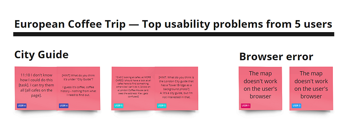
- For users 1 and 3, the webpage didn’t load the cafe pins on their system (one Windows, one Mac), so the task couldn’t be completed.
- Users 4 and 5 couldn’t complete the task without a hint (the “City Guide” cards with a picture of a city on the background are perceived as city guides, not as coffee guides for that city).
Best Coffee Guide — usability testing insights

- Users 1 and 3 skip through onboardings. User 1 said, “when they try to explain something, I usually hit directly OK.”
- 4 out of 5 people closed the subscription pop-up, without reading it. After repeatedly closing the pop-up while trying to complete the task, they were given the hint to scroll down the pop-up to reveal a payment button.
- All users were confused by:
1) “Near Me”: the associated icon, the content under the button (search in other cities); user 4 thought it was a status, not a button;
2) ”Map view” button: user 3 thinks it looks like a “bookmark” and user 1 thinks it is “not visible”;
I didn’t find that the interface was difficult, I just felt that the process they were trying to put me through was annoying. I’m the type of person that thinks ‘you tricked me into this and now you want money but you didn’t ask me at the beginning’. I was getting that vibe from the app.
— User 2After the trial period it’s paid but it’s cheap. I don’t even care if it’s free or not. It’s irrelevant, the difference is too small.
— User 4
Benchmark prototype — top usability problems
After testing with the first three users, my initial assumptions were confirmed: BCG onboarding and subscription popup don’t explain effectively what is free and what is premium; plus, the CTA on the subscription popup might be never seen by a quarter of users [0.33x4/5=0.26]). At the same time, the task on my prototype was intuitive, and users completed it fast.
The main task
All users completed the task fast. User 2 noted: “I think this was intuitive, direct, obvious. I didn’t really have to think, because it behaved in a way that I thought was predictable.”
Sharing a cafe
When users shared the café with their friends and, they were asked to check what their friends actually receive. I wanted to test how they perceive a promotion message in the footer of the shared cafe. Users 1, 3 and 4 perceived it as advertising and didn’t read it. When asked “What do you think this visual wants? Who do you think it belongs to?”, user 5 couldn’t answer, although it was the same brand as in the app onboarding.

Benchmark prototype — onboarding and free version
Starting with users 4 and 5, I wanted to also test an effective onboarding+subscription alternative to BCG: fewer cards, less info, aim for people to memorize only the main benefits, differentiate clearly how free and premium look, and ask upfront for a subscription payment.


Onboarding
I’ve tested an onboarding with three cards:
1) what the app is about: search by location / by address / by city / by cafe;
2) What you get from the free version (3 cafes around your location);
3) What to do, after one month, to search anywhere — pay £3 per year.
Free version
Testing insights: users 4 and 5 tried clicking on all page elements trying to find something clickable. Although there was a “Free version” tag on the page, users ignored it.
There needs to be something on the screen to say that you’re on the free version.
— User 5
Quantitative insights


Revised design


4. Deliver
- Benchmark prototype
- Improving the Best Coffee Guide
- Figma interactive prototype
4.1 Benchmark prototype

4.2 Suggestions for improving the Best Coffee Guide
I’ve had to cover a lot of ground just to suggest the following improvements. Best Coffee Guide can increase the number of premium accounts by:
- moving the subscription button up so it becomes visible on mobiles with screens less than 720px high;
- making the subscription popup clearer: what people get for it;
- making onboarding shorter — removing login and location would make it two times shorter;
- focusing the shorter onboarding on making clear what is free, premium, and what you get for each;
- combining Near Me, Search by cafe, Search by city into a single search box with these options unfolding on tap;
- Making it obvious when you’re on a free plan after the free month is over. People in my usability test forgot they were on trial after a few minutes, even if the page had written on it “Free version”.
4.3 Figma interactive prototype
https://bit.ly/3lHlsJA [link opens a new tab]
Outcomes. Reflection on work. Next
I started this project with the intention to improve Best Coffee Guide app usability. I’ve only suggested improvements for the most frequent problems, but there’s still scope for solving the pain points of our secondary persona with a study of how to avoid unbiased reviews after going to a specialty cafe.
Beyond that, there are many questions from my initial mind map that are still intact. Who is taking care of specialty ignorants? I dream of a specialty coffee app focused on community spirit and appealing to people who should discover the basics of the specialty niche — these people are as much as 99% of the world and they would surely appreciate a better coffee cup.


